Plotting predictions and effects
import numpy as np
import pandas as pd
import statsmodels.api as sm
import statsmodels.formula.api as smf
from pymargins import Margins

rng = np.random.default_rng(42)
n = 2000
df = pd.DataFrame({
    "age": rng.integers(20, 75, n),
    "female": rng.binomial(1, 0.52, n),
    "treated": rng.binomial(1, 0.40, n),
    "region": rng.choice(["N", "S", "E", "W"], n),
})
lp = (-1.5 + 0.04 * df["age"] - 0.3 * df["female"] + 0.8 * df["treated"]
      + 0.2 * (df["region"] == "S") + 0.4 * (df["region"] == "E")
      - 0.1 * (df["region"] == "W"))
df["y"] = rng.binomial(1, 1 / (1 + np.exp(-lp)))

fit = smf.glm("y ~ age + female + treated + C(region)", data=df,
              family=sm.families.Binomial()).fit()
m = Margins.log_scale(fit, at="overall")
MarginsResult.to_frame() returns a plot-ready table. Combine with
matplotlib for prediction curves and forest plots.
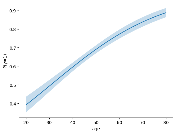
Prediction curve over a continuous variable
import matplotlib.pyplot as plt

ages = list(range(20, 81, 2))
res = m.predict(atexog={"age": ages})
df = res.to_frame()

fig, ax = plt.subplots()
ax.plot(df["age"], df["estimate"])
ax.fill_between(df["age"], df["ci_lower"], df["ci_upper"], alpha=0.25)
ax.set(xlabel="age", ylabel="P(y=1)");
Forest plot of contrasts
Forest plots need scenario labels, so build the data from a contrast call rather than a raw prediction:
from pymargins import reference

scen, W = reference("region", ["N", "S", "E", "W"], ref_level="N")
res = m.contrasts(scenarios=scen, contrasts=W)
df = res.to_frame()

fig, ax = plt.subplots(figsize=(4, 3))
y = range(len(df))
ax.errorbar(
    df["estimate"], y,
    xerr=[df["estimate"] - df["ci_lower"],
          df["ci_upper"] - df["estimate"]],
    fmt="o", capsize=3,
)
ax.axvline(0, color="grey", lw=0.5)
ax.set_yticks(list(y))
ax.set_yticklabels(df["label"])
ax.set_xlabel("Risk difference")
ax.invert_yaxis()
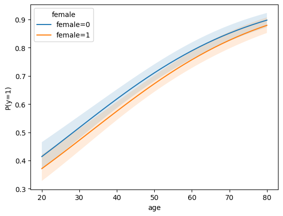
Subgroup curves (atexog with two variables)
predict with a multi-variable atexog returns a long-form table
with one row per grid point — group by the conditioning variable
when plotting.
import matplotlib.pyplot as plt

ages = list(range(20, 81, 2))
res = m.predict(atexog={"age": ages, "female": [0, 1]})
df = res.to_frame()

fig, ax = plt.subplots()
for level, sub in df.groupby("female"):
    ax.plot(sub["age"], sub["estimate"], label=f"female={level}")
    ax.fill_between(
        sub["age"], sub["ci_lower"], sub["ci_upper"], alpha=0.15
    )
ax.set(xlabel="age", ylabel="P(y=1)");
ax.legend(title="female");
Faceted contrasts (forest plot with labels)
Contrasts carry scenario labels, so to_frame() produces a label
column that is ready for forest plots:
from pymargins import reference

scen, W = reference("region", ["N", "S", "E", "W"], ref_level="N")
res = m.contrasts(scenarios=scen, contrasts=W)
df = res.to_frame()

fig, ax = plt.subplots(figsize=(4, 3))
y = range(len(df))
ax.errorbar(
    df["estimate"], y,
    xerr=[df["estimate"] - df["ci_lower"],
          df["ci_upper"] - df["estimate"]],
    fmt="o", capsize=3,
)
ax.axvline(0, color="grey", lw=0.5)
ax.set_yticks(list(y))
ax.set_yticklabels(df["label"])
ax.set_xlabel("Risk difference")
ax.invert_yaxis()